
Let me just get this out of the way. I tend to not like Millar’s work. In almost everything I’ve read by him it seems he boils down characters to their most dickish and unlikeable. Then he throws on crudity and hate and mean-spiritedness and it gets praised and I get confused as to why. What was fun about Wanted loses its charm when it is seen again and again in The Ultimates, Kick Ass, Civil War (admittedly not crude, but not enjoyed) etc. So why would I give this a chance when I tend not to like it? I heard it wasn’t a typical Millar book. And because it has Goran Parlov on art. Read on and see what I think.
Possible spoilers follow.
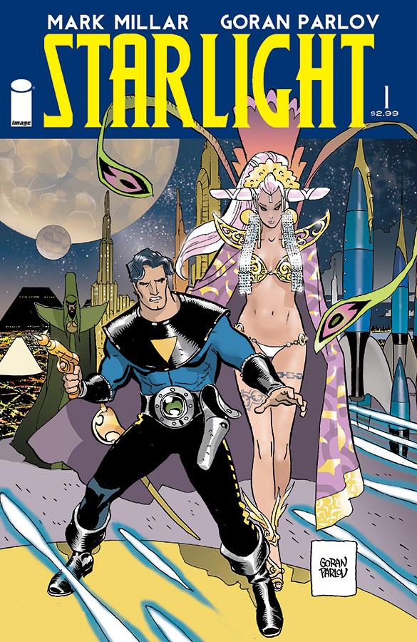
Starlight #1
Writer: Mark Millar
Artist: Goran Parlov
Publisher: Image
The story being introduced is so far relatively simple, and I do not mean that as a slight. What would happen if Flash Gordon or Adam Strange had decided to return to Earth and marry the sweetheart they left behind. At least that is how it feels to some one only basically familiar to those characters. Millar tells us that guy, here named Duke, would then live a typical life. Gets married, grows old, has kids who then have kids. Then his wife dies and the loneliness sets in. The kids live elsewhere and don’t have time to visit. But maybe, after all this time, he’ll get sucked into adventure again!
It is a fairly compelling first issue. For all the faults I find with him, Millar is good at working with archetype characters and then fleshing them out. That is basically what happens here. We’re shown what happens when Flash Gordon is forced to sing “Cat’s in the Cradle.” We really feel Duke’s sense of loneliness and longing, mostly for his life but also for something more. Of course, Parlov’s visuals make sympathizing with the characters incredibly easy. he is great at making his characters act. There is a flashback of Duke and his wife at a restaurant and I swear her eyes are sparkling. I know his art mostly from Fury MAX and Ghosted and it his great seeing the few images of space adventure that are provided in this issue.
I also want to give some applause to colorist Ive Svorcina. I can’t speak about colors intelligently. All I can say is that the colors look beautiful and fit the moods. This book ranges from otherworld celebrations, to average home, to funerals, to boardrooms and everything looks like it fits together and fits the emotion it is going for.
The only real downsides I can think of are things that are inherently Millar. Millar is not what I would consider a wordy writer. That can by a plus in that there is a real economy to the writing. It can be a minus in that one issue can feel very fast. A dense page will only have eight word gallons/captions. I want to spend more time with the characters than the issue provides. Which is a double edged sword. Also, and this is more my problem than anything with the issue, I keep expecting characters to be typically Millar. Every time the adult sons speak about Duke I expect something horrible to come out of their mouths. The closest we get is inconsiderate. I realize I’ve typecast Millar’s writing to a degree and hope that the tone of this issue continues. I also hope we get a few more characters that are genuinely likable, but not really holding my breath on that.
In summation: I am surprised by how much I like it. It is Millar using all his strengths but without his habit of feeling like he is writing for shock value. The art and colors are great and the book is a pleasure to look at. Still worried that the Millar-bomb will go off and the pleasure will be lessened.
